
Gallery walls have become a staple in modern interior design, allowing homeowners and designers alike to create a visually engaging focal point that reflects personal taste and creativity. Whether you’re decorating a small apartment or a spacious living room, a well-balanced gallery wall adds depth, character, and personality to any space. But crafting one that feels cohesive and aesthetically pleasing is both an art and a science. This guide will walk you through the key elements that define a balanced gallery wall, from planning and layout to color harmony and installation.
Contents
Understanding the Purpose of Your Gallery Wall
Before selecting art pieces or reaching for a hammer and nails, it’s essential to define the purpose behind your gallery wall. Is it meant to highlight family memories, showcase original artwork, or serve as a design feature in an otherwise neutral room? Understanding the goal will guide every subsequent decision.
Define the Focal Point or Theme
Start with a clear theme or narrative. A gallery wall should feel intentional. This could be anything from travel photography, black-and-white prints, botanical illustrations, or even a mix of personal memorabilia and art. A unified theme provides visual cohesion, even when pieces vary in size and shape.
Choose a Color Palette and Mood
Consider the room’s overall color scheme and mood. If your space is minimalist, stick to a monochromatic or neutral palette for the gallery wall. For more eclectic rooms, don’t shy away from bolder colors and varied textures. However, consistency in tone can help create balance even in a diverse collection.
Take the Room Context Into Account
The room itself plays a crucial role. A hallway gallery wall might require a linear, horizontal flow, while a living room wall behind a sofa could benefit from a grid or more expansive layout. Let the architecture and purpose of the space inform your design decisions.
Selecting the Right Art and Frames
The artwork and framing choices are the foundation of your gallery wall’s aesthetic.
Mix Different Types of Artwork
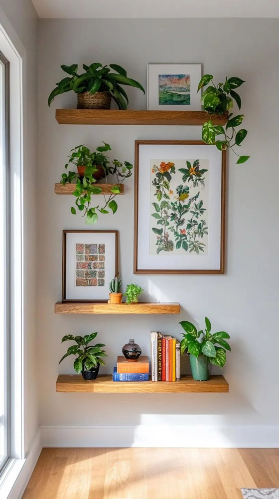
A dynamic gallery wall often includes a mix of media—photographs, drawings, paintings, typography prints, or even three-dimensional pieces like textiles or sculptures. The key is to maintain a consistent thread, such as color, tone, or subject matter, to tie the elements together.
Frame Styles and Sizes: Consistency vs. Variety
Using identical frames throughout your gallery wall lends a formal, structured look. Alternatively, mixing frame styles—such as pairing sleek metal frames with rustic wood—can create a more casual and collected feel. Regardless of your style, make sure the frames complement each other and don’t overpower the artwork.
Matting and Spacing Considerations
Matting helps provide visual breathing room and enhances the presentation of each piece. Using similar mat widths across pieces brings cohesion, especially when the artworks vary in size. Equally important is spacing—maintaining consistent gaps between frames creates order and prevents a cluttered appearance.
Planning the Layout and Composition
The most visually successful gallery walls are those that have been thoughtfully laid out before installation.
Symmetrical vs. Asymmetrical Layouts
Symmetrical layouts are structured, clean, and formal, often using matching frame sizes and equal spacing. Asymmetrical arrangements, on the other hand, offer a relaxed and creative vibe but require more planning to ensure visual balance. Neither is better—just choose the one that suits your room and style.
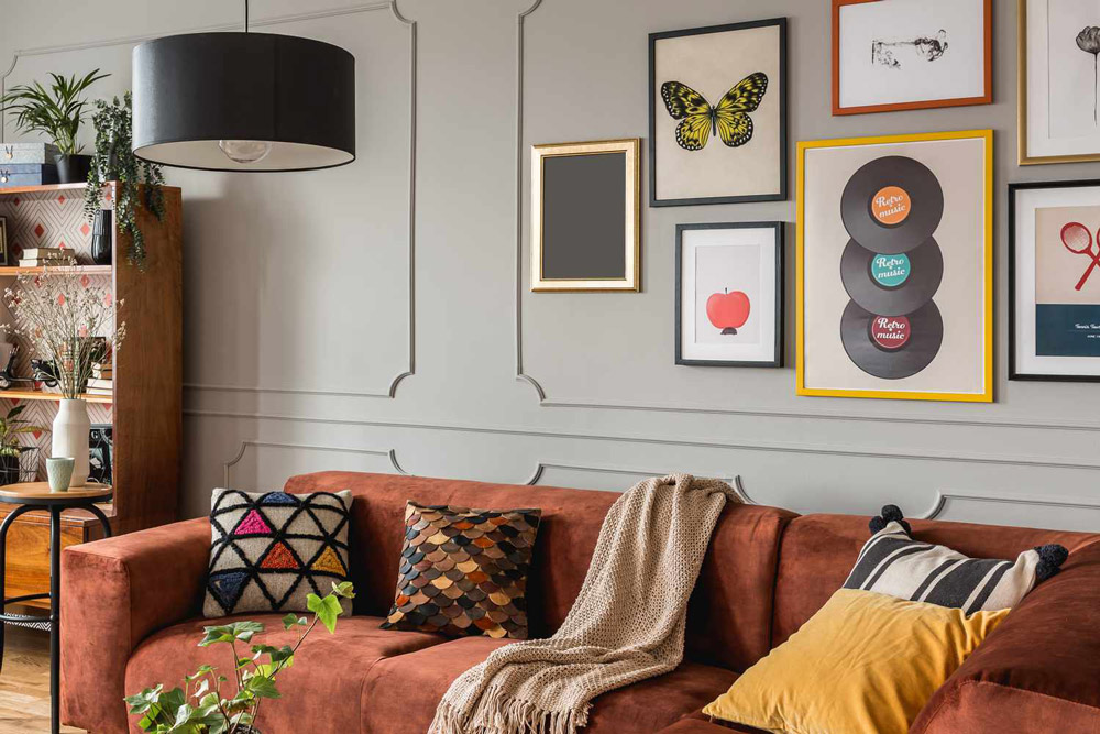
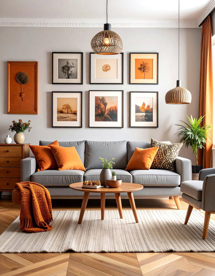
Grid vs. Salon-Style Layouts
A grid layout is precise and works best with uniform artwork sizes. Salon-style (also known as organic or eclectic) arrangements are more freeform and mimic the walls of European galleries, incorporating varied frame sizes and shapes. Salon-style offers more flexibility and is ideal for mixing personal photos with art.
Use Templates or Painter’s Tape to Map it Out
Before hanging anything, lay your gallery wall out on the floor or use cutouts and painter’s tape on the wall. This allows you to adjust placement, spacing, and alignment without damaging the wall.
Balancing Visual Weight
Visual weight refers to how much a piece draws attention based on its size, color, or detail. A balanced gallery wall distributes this weight evenly.
Size Distribution and Visual Hierarchy
Mix larger and smaller pieces strategically. One large statement piece can anchor the collection, while smaller pieces orbit around it. Avoid clustering all large items on one side—it can throw off the balance.
Color Contrast and Texture Balance
Incorporate both light and dark elements to avoid monotony. Texture also plays a role—combining glossy photos with textured canvases or mixed media adds depth and dimension to the wall.
Use Negative Space Effectively
Negative space is the area around your artwork. Use it to your advantage to prevent the wall from feeling overcrowded. Balanced spacing allows each piece to stand out while still feeling part of a cohesive whole.
Installation Tips for a Perfect Finish
Once you’ve planned your layout and selected your art, it’s time to install.
Tools and Hardware Needed
Have the right tools ready: a level, measuring tape, pencil, hammer, nails or hooks, and possibly a stud finder. For heavier frames, use wall anchors or screws. Consider adhesive strips for lighter pieces or rentals.
Proper Hanging Heights and Alignment
A general rule of thumb is to hang the center of the gallery wall about 57–60 inches from the floor, aligning with average eye level. When arranging above furniture like sofas or consoles, the bottom row of frames should be 6–8 inches above the furniture line.
Adjust and Rebalance Over Time
Don’t be afraid to switch things up. As you acquire new pieces or your style evolves, your gallery wall can adapt. The beauty of this feature is that it’s meant to be personal and dynamic.
Common Mistakes to Avoid
Creating a gallery wall is fun, but it’s easy to make design errors that disrupt harmony.
- Overcrowding: Trying to fit too many items into one space makes the wall feel chaotic.
- Inconsistent Frame Styles: Too many contrasting frames without a connecting element can look disjointed.
- Ignoring the Room’s Style: Your gallery wall should align with the overall aesthetic of the room, not compete with it.
Gallery Wall Inspiration Ideas
Need a little inspiration? Here are a few styles to consider:
- Modern Minimalist: Clean lines, monochromatic palette, equal spacing.
- Eclectic Boho: Mixed media, earthy tones, vintage frames, and organic layout.
- Black-and-White Theme: Photographic prints, white mats, black frames—classic and timeless.
Conclusion
A balanced gallery wall combines thoughtful planning, personal expression, and visual harmony. From selecting the right art and frames to mapping out a layout that complements your space, every decision contributes to the final effect. While there are guidelines to follow, don’t forget to infuse your personality. Let your gallery wall tell a story—your story—and don’t hesitate to refresh it as your taste or life evolves.
If you’re planning to turn this idea into content for your website or blog, I can help you optimize it further for local SEO, especially if it’s tied to a home decor, interior design, or art installation service.