
Wall art is often the finishing touch that transforms a room from ordinary to exceptional. Whether you’re designing a cozy living room or a tranquil bedroom, the way you place art over your sofa or bed can drastically influence the mood and visual harmony of the space. Choosing the right wall art layout isn’t just about aesthetics—it’s about scale, proportion, and how everything relates to your furniture and architecture.
In this guide, you’ll learn how to select the best layout, measure correctly, and style your wall art above a sofa or bed like a professional designer.
Contents
- Why Wall Art Layout Matters in Home Décor
- Standard Rules for Hanging Art Above Furniture
- Best Wall Art Layouts for Over a Sofa
- Best Wall Art Layouts for Over a Bed
- How to Choose the Right Size Art
- Tools & Tricks for Planning the Perfect Layout
- Style Tips to Match Art with Your Room
- FAQs About Hanging Art Over Sofas or Beds
- Conclusion
Why Wall Art Layout Matters in Home Décor
Many homeowners underestimate the impact of art placement. The wrong layout—such as artwork that’s too small, too high, or poorly aligned—can make a space feel disjointed or unfinished. Properly arranged art connects the furniture to the walls and adds a focal point that anchors the room.
Good wall art layout also contributes to balance. For instance, a large blank wall above a low-profile sofa can feel overwhelmingly empty. With the right art size and grouping, the space suddenly feels pulled together and intentional.
Standard Rules for Hanging Art Above Furniture
When placing art above large furniture like a bed or sofa, proportion is everything. There are a few key rules that interior designers consistently follow:
The 2/3 to 3/4 Width Rule
The width of the artwork or grouping should be roughly two-thirds to three-quarters the width of the furniture piece beneath it. For example, if your sofa is 84 inches wide, aim for a piece or grouping that spans 56 to 63 inches. This ensures visual balance and prevents the art from feeling too small or disconnected.
Ideal Distance Between Furniture and Art
Artwork should be placed approximately 6 to 8 inches above the top of a sofa or headboard. This keeps the grouping visually connected and avoids a floating appearance. When placed too high, artwork feels separate from the rest of the room.
Centering Tips
As a rule of thumb, try to center your art with the furniture—not necessarily the wall. The visual anchor in a living room is usually the sofa or the bed in a bedroom, not the wall itself.
General Height Guidelines
In spaces without furniture, art is often centered at 57 to 60 inches from the floor (roughly eye level). However, when hanging over furniture, that guideline is adjusted down to keep everything visually cohesive.
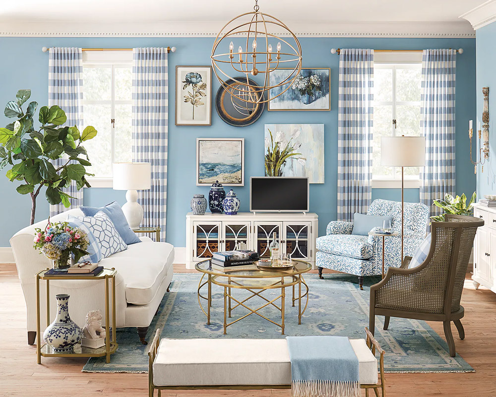
Best Wall Art Layouts for Over a Sofa
There’s no one-size-fits-all layout, but a few classic approaches work reliably well over most sofas.
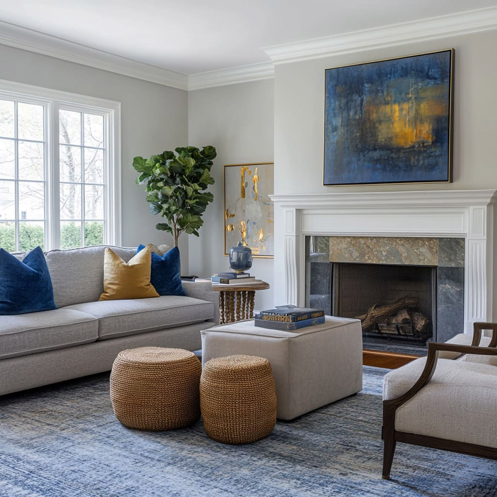
Single Large Statement Piece
A bold, horizontal piece that fills about two-thirds the sofa’s width is an elegant and modern choice. It creates a clean look and works best with minimalist or contemporary design schemes.
Gallery Wall Arrangement
This involves a collection of smaller pieces grouped together in a grid or organic formation. When creating a gallery wall, treat the entire grouping as one “visual unit.” Make sure the total width still falls within the two-thirds to three-quarters rule and keep spacing between frames tight (2 to 4 inches).
Triptychs or Dual Canvas Art
Three-panel artworks or two large prints side by side offer symmetry and rhythm. This type of layout works especially well above sectional or larger sofas where a single piece might not span wide enough.
Grid Layouts vs. Eclectic Displays
For a more formal or structured look, consider a symmetrical grid. If you prefer a more personal or creative aesthetic, arrange different-sized pieces in a curated organic layout.
Layouts for Sectional Sofas
Sectionals often need asymmetrical layouts. You can anchor the longest part of the sofa with larger art and balance the shorter side with floor lamps, plants, or wall shelves.
Best Wall Art Layouts for Over a Bed
Wall art over a bed presents a few different challenges due to varying headboard styles and the vertical alignment of beds.
Headboard Height & Layout Adjustments
If your bed has a tall or ornate headboard, opt for a wider but shorter art piece or grouping. For low-profile or platform beds, you can use taller artwork or stack multiple pieces vertically.
Horizontal vs. Vertical Orientation
Horizontal pieces help elongate the space and typically align better with the width of the bed. Vertical pieces can be effective if arranged in pairs or when framing something like pendant lights or a headboard.
Matching Wall Art to Bed Frame Style
Soft, neutral-toned art works well with upholstered or tufted headboards, while bold, graphic pieces pair nicely with modern or wooden bed frames. Make sure the style of the artwork complements the overall bedroom decor.
Minimalist vs. Maximalist Layouts
Minimalist bedrooms often do best with a single, oversized piece or a centered pair of prints. Maximalist styles can accommodate larger gallery walls, overlapping pieces, and a mix of textures and frames.
Frame Grouping Tips
Whether you’re using canvases or framed prints, maintain consistency in frame style, spacing, and alignment. Even eclectic layouts benefit from having one unifying element such as color, subject matter, or frame material.
How to Choose the Right Size Art
Sizing is often where people go wrong. Too small, and the wall feels unfinished. Too large, and it overpowers the furniture.
Measurement Formulas
Use the following formula as a baseline:
Art Width = Furniture Width × 0.66 (or up to 0.75)
Then calculate how many pieces (and what sizes) will fill that space comfortably. Always account for spacing if using multiple frames.
Mistakes to Avoid
- Hanging art too high
- Using frames that are too small or too many small pieces scattered
- Mismatched frame colors or clashing styles
- Ignoring alignment with the furniture below
Wall vs. Art: Balancing Negative Space
Negative space is important. Don’t try to “fill” every inch of wall. The empty space around artwork helps highlight it and makes the layout breathe.
Tools & Tricks for Planning the Perfect Layout
Avoid costly mistakes by planning before you hang.
Painter’s Tape & Paper Mockups
Use tape to outline frame dimensions directly on the wall. Alternatively, cut kraft paper to the size of each frame and experiment with layout options.
Printable Layout Templates
There are dozens of free or paid layout guides online that you can print and use as visual references.
Apps or AR Tools
Design apps like Canva, Morpholio Board, or even IKEA Place can help visualize layout and scale in real-time.
Anchoring and Safety
Especially over a bed, use proper hardware and wall anchors. For heavier frames, consider French cleats or double anchor points.
Style Tips to Match Art with Your Room
Art should enhance—not fight against—the existing room style.
Frame Styles That Fit the Furniture
Use metal frames with modern sofas, rustic wood frames with farmhouse décor, and sleek black or white frames for contemporary interiors.
Matching Color Schemes
Choose art that incorporates or complements the dominant colors in your pillows, rugs, or bedding.
Creating a Focal Point
Use wall sconces or picture lighting to highlight your layout. This not only elevates the presentation but also draws the eye to the focal area of the room.
Swappable Layouts
If you like to change things seasonally or for events, consider ledges or shelves that allow you to swap art without new holes.
FAQs About Hanging Art Over Sofas or Beds
How high should art hang above a sofa?
6 to 8 inches above the back of the sofa is ideal.
What size art fits over a queen bed?
Aim for artwork 48 to 60 inches wide.
Can I hang multiple pieces over a bed or sofa?
Yes. Just ensure the total grouping width is proportional to the furniture.
Do I need to center art with the wall or the furniture?
Always center art with the furniture, not the wall.
What if I have a sectional or corner sofa?
Use asymmetrical layouts or staggered groupings.
Conclusion
Wall art layouts are about more than just filling space—they’re a visual language that expresses your personality and anchors your design. Whether you opt for a single striking piece or a carefully curated gallery wall, following these layout principles ensures your room feels balanced, polished, and uniquely yours.